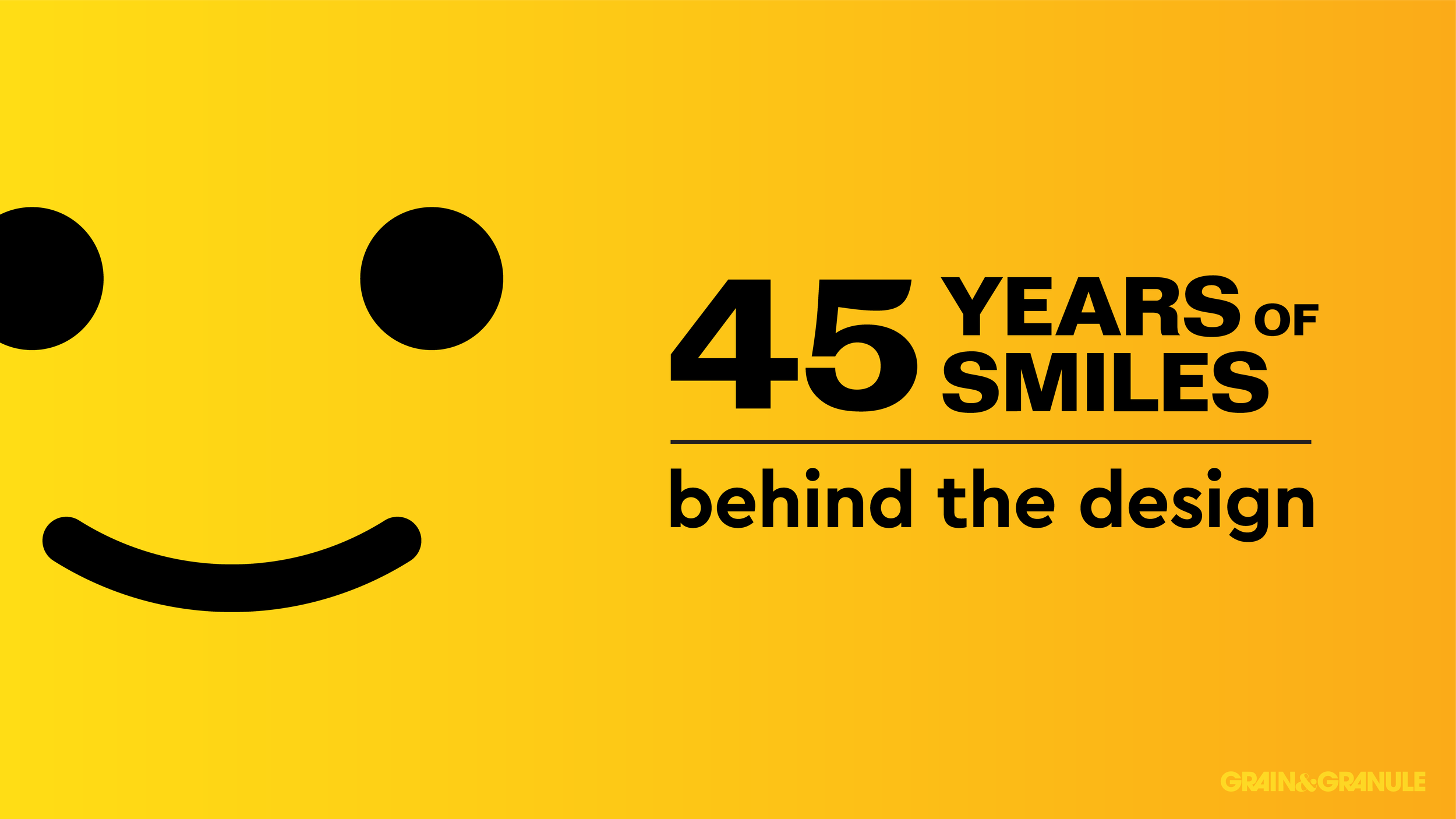
Behind the Design: The Iconic LEGO Minifigure Smile
/
A nice easter egg from the designers.
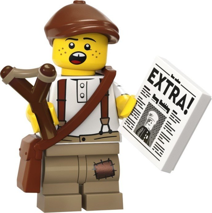
Some time ago, a good friend of mine (Richard from The Rambling Brick) pointed out that the Collectible Minifigure newspaper kid is holding a newspaper with a front-page article on the original classic town police officer. What’s more, though, is that the headline, judging by the ascenders and descenders of the heavily obscured text, appears to read Happy Birthday!
In this installment of Behind the Design, I take a look at the iconic LEGO minifigure smile to reveal its design secrets, learn how it has evolved, and show examples of how it has been utilized over the decades.
In The Beginning
The original LEGO minifigure designed by the late Jens Nygaard Knudsen has remained an icon in the toy world since its inception in 1978. But if you look closely, the original 1977 patent and indeed the earliest sets depict an ever so slightly modified version of the face you’re likely familiar with today.
As you can see in the design analysis below, the original minifigure smile was a geometrically perfect design, but sometimes perfect designs don’t look so perfect to the human eye.
My best guess is that with the rush to get the minifigures to market, there may not have been time to further finesse the design of the face, and so what was released in the earliest iterations of the figure is this geometrically perfect creation. Being created at a drafting table, it would stand to reason that the design would have been made out of nothing more than circles and lines at even increments; quite rudimentary but oh so pleasing!
The eyes are two of their own width apart, the centre line of the mouth appears to be two eye widths down from the eye line, and the mouth stroke itself is a third of the width of the eye. Of course, the mouth terminates on each side in line with the centre of the eye.
(As a side note, you may have noticed the more chiseled jawline on the firefighter there. The original minifigure heads weren’t as round as they are today either.)
The Definitive Edition
In the following decade, both the mould for the head and the print that appeared on it had changed. The face was refined with an ever-so-slightly tightened smile radius and larger eyes which, at least to me, made all the difference. The smile was friendlier, more approachable, and more fun!
That wasn’t the only change that would give the minifigure some more personality. Not long after, we were treated to a suite of fantastic mustache-brandishing and lip-smacking prints. With a small selection of design elements like fringe, stubble, and a few personalised details, one face now became a whole gang of unkempt pirates!
Strangely, a few prints in the following years retained the original geometric face with the additional embellishments but as far as fans were concerned this style was here to stay.
Reinventing the Past
Looking at those original faces, it couldn’t hurt to try something new, right? I experimented with illustrating a few different faces following the same simple style as the earliest minifigures and came out with three designs I liked.
The clown’s mouth makeup radius shares the width of the eye, and the eye lines share the width of the mouth, which altogether creates a pleasingly simple but consistent structure. The mutton-chop/handlebar mustache combo was probably the cutest Lemmy from Motörhead has ever looked, but it’s interesting how simple the shapes can be and still maintain some semblance of recognisability. Lastly, with all the smiles floating around my screen, I figured who better to portray in brick form than the everlasting grin himself, Kjeld Kirk Kristiansen.
(Kjeld, if you ever see this, I know your life has had it’s ups and downs and downs and ups, but everyone who has seen my photo of us together at Skaerbaek tells me you have the smile of someone who’s lived a life with LEGO, so I hope this suggested minifigure face does it justice! Anyone want to update their business card minifigure now?)
A Modern Smile
Brickset covers the following evolution of minifigure heads in great detail so I don’t want to double up unnecessarily, but a few key steps take place that I can mention. The fine folks at LEGO, always wanting to adapt and improve, of course, wanted to see what else they could do with their blank canvas. Eyebrows, proportional adjustments and even *shudders* noses were added to the mix! The 90s and early 2000s brought about a plethora of new themes including licensed media, so the necessity for new and specific prints for faces became rapidly more apparent.

As the years rolled on, pupils became a staple, and the playful, bold style became the new standard. It’s great seeing how LEGO’s graphic designers invent new expressions with just a few line thickness and proportion constraints, much like the way you see new animals produced following a specific art style for Friends and general themes.
To think that all of this development stemmed from just a few simple lines and circles drafted on paper is the kind of thought that I have sometimes which helps me put my own design work and challenges into perspective. It’s not just a few simple lines and circles—it’s a carefully considered algorithm, designed within the technological limitations of the time, that had the power to bring joy to kids everywhere and change the world.
That’s certainly something to smile about.
Best of BrickNerd - Article originally published April 6, 2023.
What’s your favourite minifigure expression? What could the next great face development be? Leave your thoughts in the comments below.
Do you want to help BrickNerd continue publishing articles like this one? Become a top patron like Charlie Stephens, Marc & Liz Puleo, Paige Mueller, Rob Klingberg from Brickstuff, John & Joshua Hanlon from Beyond the Brick, Megan Lum, Andy Price, Lukas Kurth from StoneWars, Wayne Tyler, Monica Innis, Dan Church, and Roxanne Baxter to show your support, get early access, exclusive swag and more.